Our words hold power, and so does our typography. The choice of size, font, and style plays a vital role in shaping the identity of the Penn Highlands brand. Typography not only amplifies the College’s voice, but also strengthens smart, insightful ideas. The typefaces outlined below are carefully selected to reflect and embody our mission and vision.
Primary Typefaces
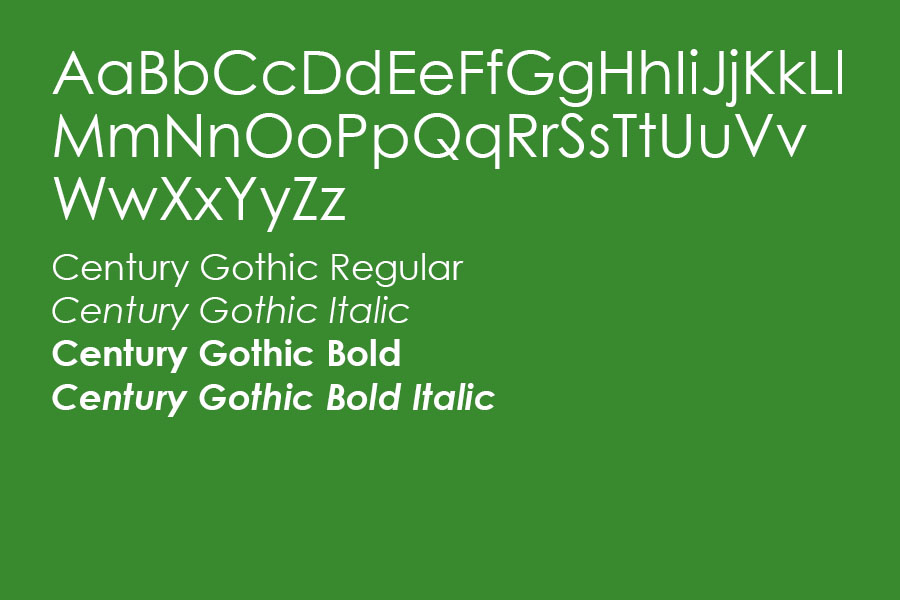
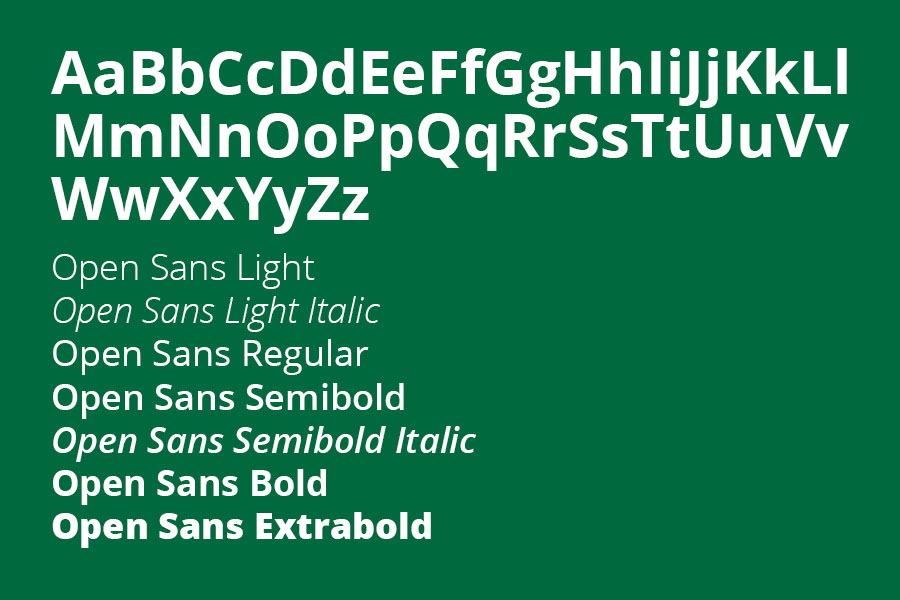
Our primary typefaces include Century Gothic and Open Sans. Both font families can be used in all instances, including subheads and body copy.
Secondary (Emphasis) Typeface
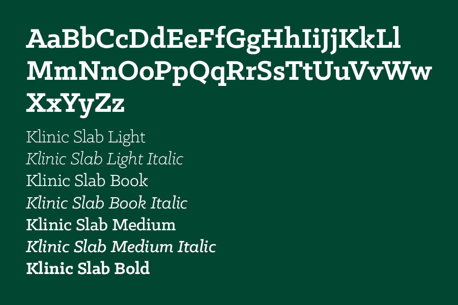
Our secondary typeface is Klinic Slab. The Klinic Slab Font Family is to be used when showing emphasis or importance. Klinic Slab is compelling enough for headlines, but its style lends it to not being legible for large amounts of smaller copy. Klinic Slab is preferred for headlines or short, important sentences.
Font Size: The recommended font size is 10 pt, with 12 pt as an acceptable alternative. This ensures the text remains clear and readable while keeping essential information prominently displayed.
Font Family Type: For web content and materials, use the regular font as the standard. Reserve bold fonts exclusively for headers, ensuring clear hierarchy and focus. Italics should be used sparingly and only to emphasize specific points, maintaining a clean and professional appearance.
Alternate Font: If the brand’s primary typefaces are unavailable, the Arial Font Family serves as an appropriate alternative.
Logo Fonts: The logo features Cassannet Bold and Lithos Pro, two typefaces thoughtfully chosen to complement the College’s mountain symbol. These fonts are integral to the logo’s design and must remain unaltered. They should not be used independently of the logo under any circumstances.
To download any of these typefaces, please contact Marketing & Communications.